
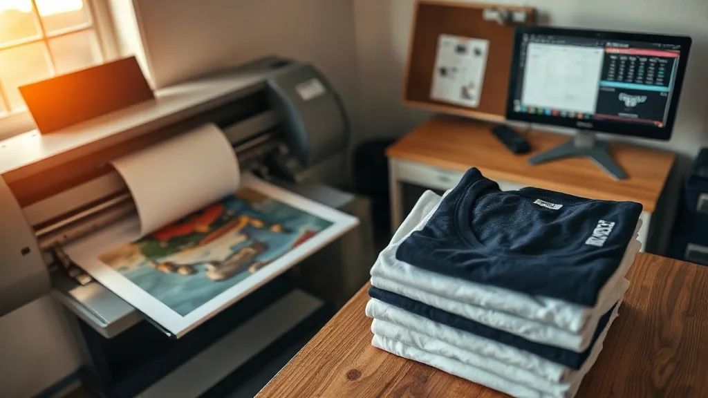
You have spent an afternoon dialing in your press, the powder is cured evenly, and the film peels clean. Then the shirt comes off the platen and the red is orange, the navy looks nearly black, and the customer's brand color is nowhere close. Most shop owners blame the press or the powder at this point. In reality, the problem usually sits earlier in the chain, in how your computer and your printer talk to each other about color. This guide is about that chain. It covers how to build a color workflow for dtf transfers that gives you the same result on Tuesday that you got on Friday, on cotton and on polyester, on a cheap tee and on a premium hoodie.
Why Color Drift Happens Long Before the Heat Press
Every image you print passes through at least four color decisions. Your design software interprets the file. Your operating system converts it for the printer. Your RIP or printer driver applies its own settings. The printer itself lays down ink in a specific order and density. Each of those steps is a chance for the color to shift, and if any one of them is inconsistent, the final transfer will be inconsistent too.
The trap most small shops fall into is adjusting one step to fix a problem created by another. Someone prints a dull red, so they crank up saturation in the design file. The next job uses a different file with different settings, and now the red is too hot. Without a fixed reference point, every job becomes a one-off experiment.
An ICC profile is that fixed reference point. It is a small file that describes, in measurable terms, how a specific printer with specific ink and specific film reproduces color. When your software and your RIP both respect that profile, the guesswork disappears. You are no longer asking whether the red will come out right. You are asking whether the profile is still accurate, which is a much easier question to answer.
Building a Color Pipeline That Actually Holds
Start with a calibrated monitor
You cannot judge a print against a screen that is lying to you. A consumer monitor straight out of the box is typically too bright and too blue, which makes prints look muddy by comparison. A hardware calibrator, even an entry-level one, fixes this in about fifteen minutes. Run it monthly, and keep the monitor in a room with consistent lighting. If you edit at night with a warm desk lamp and print in the morning under a window, your judgment will swing with the light.
Standardize your working space
Pick one RGB working space and stay in it. Adobe RGB or sRGB both work. What matters is that every file entering your workflow gets converted to that space before you do anything else. Mixed working spaces are one of the most common causes of a print that looks nothing like the file. If a customer sends you a phone photo in whatever space their camera chose, convert it on import rather than letting the RIP decide.
Let the RIP do the conversion
Once your file is in a known RGB space, the RIP should handle the conversion to the printer's ink space, using the profile built for that printer, that ink set, and that film. Do not double convert. Do not let the design software embed one profile and the RIP apply another. Turn off color management in one place and let the other own it completely. In most shops, the cleanest setup is to disable color management in the design software at export and let the RIP be the single authority.
Profile for your actual materials
A profile built for one film and one powder combination is not automatically valid for another. Film coatings vary in how much ink they absorb, and powder granule size affects how the cured layer scatters light. If you switch film brands or move from a fine powder to a coarser one, re-profile. Many RIP packages include a profiling module, and a basic profile can be built with a color target and a spectrophotometer in under an hour. If you do not own a spectrophotometer, many ink suppliers will build a profile for you if you send them a printed target.
Choosing the Right Settings for dtf Output
The settings you choose in the RIP have a bigger effect on the final look than most people expect. Ink limits, halftone method, and white layer handling all interact with the profile.
- Ink limit: Set this based on your profile, not by eye. Pushing total ink too high causes bleeding on the film and a tacky cure. Too low and colors look washed out.
- Halftone method: Error diffusion tends to hold fine detail better on film, while ordered dithering can produce more consistent solid areas. Test both on your own film before committing.
- White layer: The white ink layer under the color is what makes the transfer opaque. Its density should be set so the cured transfer blocks the shirt color without becoming so thick that it cracks. A white layer that is too heavy is a common reason prints feel stiff.
- Resolution: Higher is not always better. Very high resolutions slow production and can increase ink usage without a visible gain. Match resolution to the detail level of the artwork.
Once these are set and locked, write them down. A simple settings sheet taped to the wall next to the printer saves hours of re-testing when someone new runs a job.
Soft Proofing Before You Print
Soft proofing is the practice of previewing how an image will look on the final output before you commit ink and film. In Photoshop and similar tools, you load the printer profile as a soft proof and the software simulates the color shift. It is not perfect, but it catches the obvious problems: out-of-gamut colors that will clip, skin tones that will go green, brand colors that will not survive the conversion.
The habit is especially valuable for client work. When a customer sends a logo with a saturated brand color, soft proof it first. If the color falls outside what your printer can reproduce, you can tell them before the job runs rather than after. That conversation is much easier to have up front, and it builds trust.
Matching Shirt Color to Print Color
Here is a factor that no profile can fully solve: the shirt itself. A transfer printed on white film and pressed onto a black tee will look different from the same transfer on a white tee, because the white ink layer is doing more work and the fabric texture shows through differently. On light garments, the shirt color can subtly influence the perceived tone of the print, especially in thin or semi-transparent areas.
The practical fix is to test on the actual garment you will be printing. Keep a small library of test presses on your most common shirt colors, white, black, navy, heather grey, and a couple of popular pastels. When a new job comes in, compare against those samples. If you are sourcing dtf transfers near me from an outside supplier, ask whether they can send a sample press on your target garment before you commit to a large order.
Keeping Records That Save You Money
A color log is unglamorous and it is the single best investment a small shop can make. For each job, note the file name, the profile used, the RIP settings, the film and powder batch, press temperature, pressure, and dwell time. When a reorder comes in six months later, you can reproduce the result instead of starting over.
Batch tracking matters too. Ink lots and film lots change slightly over time, and a new batch can shift color by a noticeable amount. If you notice a drift, check whether you changed materials before you start adjusting profiles. Nine times out of ten, the profile is fine and the batch is different.
Frequently Asked Questions
Do I really need a custom ICC profile, or can I use the printer's default?
The default profile is a starting point, not a solution. It is built for the manufacturer's reference conditions, which rarely match your film, your powder, and your shop environment. A custom profile built on your actual materials will almost always produce more accurate and more consistent color, especially for brand colors and skin tones.
How often should I re-profile my printer?
Re-profile whenever you change film brand, powder type, or ink set, and consider a fresh profile every six to twelve months even if nothing changes, since printheads wear and ink chemistry can drift. If you notice a sudden color shift, check materials and printhead health before assuming the profile is stale.
My monitor and my prints still do not match. What am I missing?
Check three things in order. First, confirm the monitor is calibrated and the viewing light at your desk is neutral. Second, confirm only one piece of software is doing the color conversion. Third, confirm the profile you are using matches the film and powder currently loaded. Most mismatches trace back to one of those three.
Can I get accurate color on dark garments?
Yes, but the white ink layer becomes the deciding factor. A well-set white layer gives you a neutral base that the color can sit on. If the white is too thin, the shirt color bleeds through and shifts the tone. If it is too thick, the print feels heavy and may crack. Test a few white density settings on your darkest common garment and keep the best result as a reference.
Is it worth profiling if I only print a few jobs a week?
For low-volume shops, a full custom profile may be overkill, but a locked-down workflow is not. Even using a supplier-provided profile with consistent RIP settings and a calibrated monitor will eliminate most of the surprises. The goal is predictability, and that pays off at any volume.
Where to Go From Here
Color management is not a one-time task, it is a habit. Calibrate the monitor, lock the RIP settings, profile for your real materials, and keep a log. Do those four things and the frustrating days where a print comes out wrong for no obvious reason become rare. The press and the powder still matter, of course, but they stop being the scapegoat for problems that were never about heat in the first place.